Quadra
Download Options
 Free Version
Purchase Watchface - $3.99


Quadra - GB - Manual
Table of Contents
The watchface
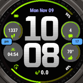
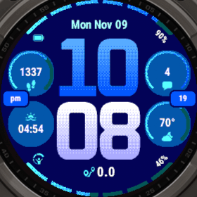
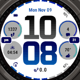
- Date at the top.
- Time in the middle: the hour above the minute.
- Four circles, two on each side of the time. Each shows a data field with its icon. A field with a goal, such as your steps, gets a progress ring in its circle.
- Two arcs along the top and bottom edge of the screen. They show the progress of a field, with its icon on the left and its value on the right.
- Two pills at the left and right edge: am/pm and the seconds by default.
- Bottom field below the time, with its icon left of the value.
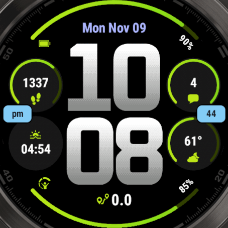
On watches with vector fonts, the value of an arc is written along the arc: clockwise at the top and counterclockwise at the bottom, so you can read both. On other watches, and when you pick a Small Font that isn't a vector font, it is written straight. The icon is always upright.
Opening the settings
All settings are on the watch. The basics are also in the Connect IQ app on your phone, see Settings on your phone.
On your watch, go to Menu → Watch Face → Quadra and choose Customize, edit, configure or the edit icon. The exact path and wording are slightly different on every model.
Your settings are stored on the watch. They usually stay when you reinstall the watchface, but this isn't guaranteed.
The menus of this manual (Arcs, Circles, Pills & Bottom, Date, Background and Always-On Display) are at the end of Advanced options. See the Settings Menu Map for the rest of the menu.
Settings on your phone
In the Connect IQ app, choose My Device → Watch Faces → Quadra → Settings. You find the basics there, and everything else stays on the watch. How it all works is explained in Settings on Your Phone.
- Theme and Load Profile, and in the free version the Pro Code.
- The options of this watchface: Gradient Style, Arc Style, Ring Style and Arc Segments. A theme also sets these, so when you choose both in one save, the theme wins.
- DATA FIELDS: every field from the table below, each with its label. The AOD Field is only there on AMOLED watches.
- FONTS: the Hour, Minute, Text, Small, Date and Bottom Font, and on AMOLED the Hour and Minute AOD Font. On a watch with scalable fonts, the Text, Small, Date and Bottom Font also have a size.
- COLORS: every color, like the time, the arcs, the rings, the circles and the pills. The Background Color is only there on MIP watches, the pattern color (Background) and the AOD colors only on AMOLED.
- PLUGIN FIELDS and Custom Text at the bottom.
Changing a data field
- Open Data.
- Choose Pick on screen and select a field on the watchface, or choose a field from the list.
- Choose the Data row, then a category, then the field you want.
- Use Data Options for its format, units and refresh time.
The fields on this watchface
| Field | Where it is | Default |
|---|---|---|
| Date | At the top | The date, such as Sat Nov 07 |
| Top Arc | The arc along the top edge | Battery |
| Bottom Arc | The arc along the bottom edge | Body Battery |
| Top Left | The upper circle on the left | Steps Today |
| Top Right | The upper circle on the right | Notifications |
| Bottom Left | The lower circle on the left | Sunrise |
| Bottom Right | The lower circle on the right | Current Temperature, with the weather icon |
| Bottom | Below the time | Distance Today |
| Left Pill | At the left edge, between the circles | am/pm |
| Right Pill | At the right edge, between the circles | Seconds |
| AOD Field | AMOLED only: below the time on the always-on display, in the modes with a data field | The date, with the status icons |
Pick on screen has every field except the AOD Field. Find that one in the list, or in Advanced options → Always-On Display.
You can also go to the same fields through Advanced options: Arcs, Circles, Pills & Bottom and Date. To set up a custom date, see Custom Date & Time Formats.
Time
Open Time options in the settings. You see a preview at the top, with the selected option below it. Press select to go to the next value of that option.
- Hour Color 1, Hour Color 2, Minute Color 1, Minute Color 2: without a gradient, the last digit gets Color 2 and the other digit Color 1. With a gradient, every digit goes from Color 1 to Color 2.
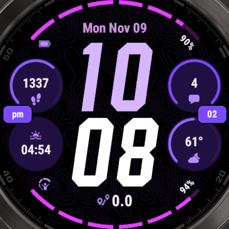
- Gradient Style: No Gradient, Regular or Ellipse.
- Hour Font, Minute Font: see Time fonts. The Minute Font can be Same as Hour, the default.
- Hour AOD Font, Minute AOD Font, AOD Time Color: AMOLED only, see Always-On Display.
- 24 Hour, Leading Zero
Every font is as big as it can be between the circles, so a narrow font like Oswald is taller than a wide one like Oxanium. On AMOLED, a gradient on any font but Squares turns the background pattern off.
Gradient Style
Time fonts
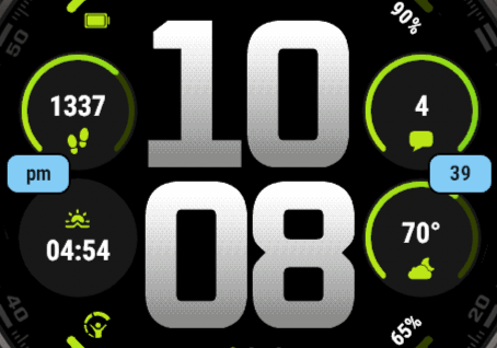
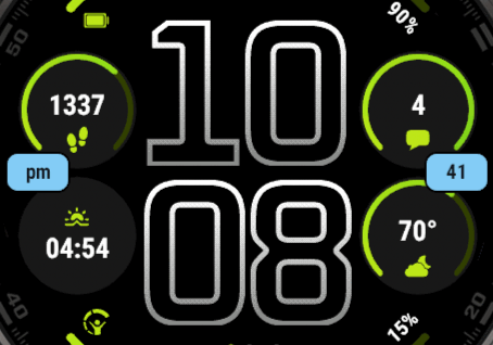
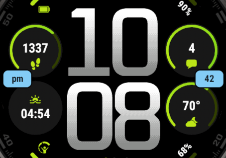
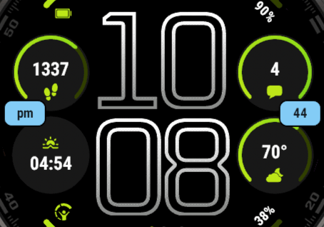
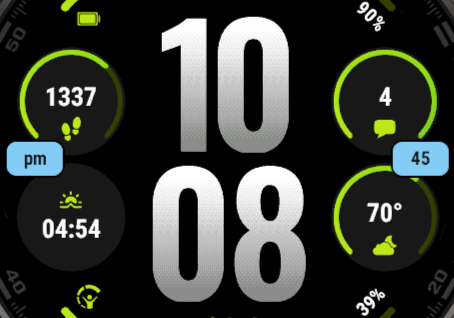
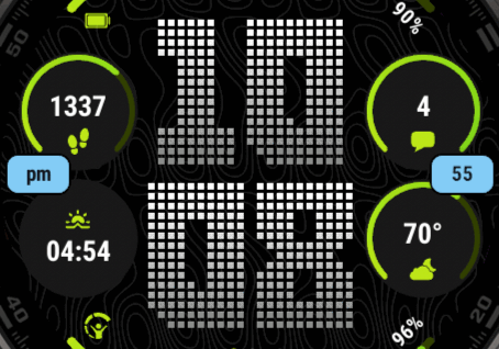
Change the time fonts in Time options, or all fonts in Advanced options → Fonts. The hour and minute can each have their own font. There are 11 time fonts:
- Smooth fonts: Oxanium (the default), Oxanium Light, Oswald, Blocky and Barlow, each also as an Outlined version. They have smooth edges.
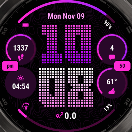
- Pixel font: Squares. Sharp pixels, no smoothing. It has no Outlined version.
Fonts and the background pattern
On AMOLED, the background pattern goes on under the time. A gradient on a smooth font is drawn with a box around each digit, which would cover the pattern. So with a gradient and a smooth font, the pattern is turned off. Squares is drawn from images that are see-through around the digits, so it keeps the pattern, with or without a gradient.
The other fonts
Advanced options → Fonts also has the Text Font (the values in the circles), the Small Font (the arc values, the pills, text labels, and a circle value that is too wide for the Text Font), the Date Font, the Bottom Font and, on AMOLED, the two AOD fonts. These use the fonts of your watch. See Fonts.
Oxanium
Oxanium Outlined
Oxanium Light
Oxanium Light Outlined
Oswald
Oswald Outlined
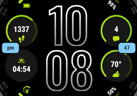
Blocky
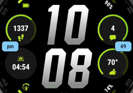
Blocky Outlined
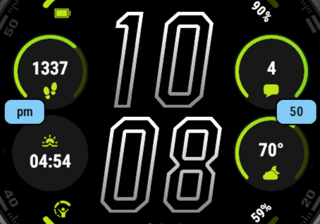
Barlow
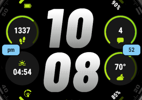
Barlow Outlined
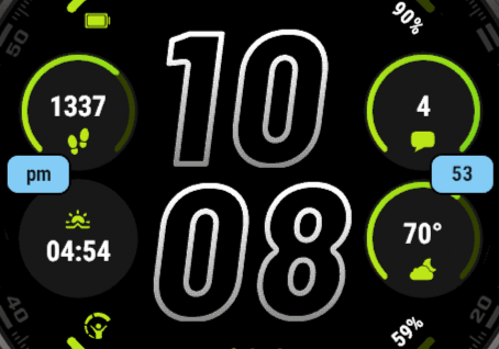
Squares
Arcs
The arcs along the top and bottom edge are in Advanced options → Arcs. Both fill from left to right. An arc shows the progress of its field, with the icon of the field at its left end and the value at its right end. A field without progress, such as the time in another city, leaves its arc unfilled. See Goals & Progress Bars to set your own goal.
- Top Arc, Bottom Arc: the fields, Battery and Body Battery by default.
- Arc Style: see below.
- Color 1, Color 2, Color 3: Color 3 only appears with the single color styles.
- Unfilled: the part of the arc that isn't filled yet. 70% darker (the default) or 40% lighter than the arc color, or Pick color. Not with Single color filled, which has no unfilled part.
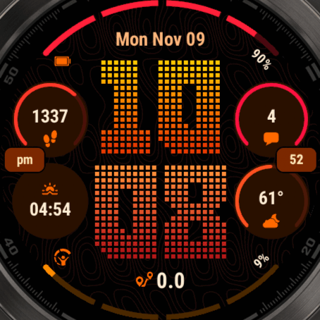
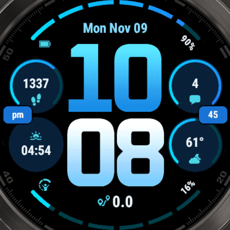
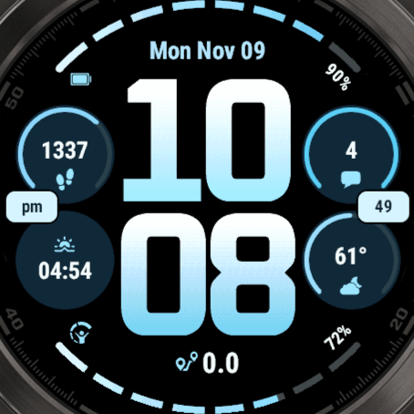
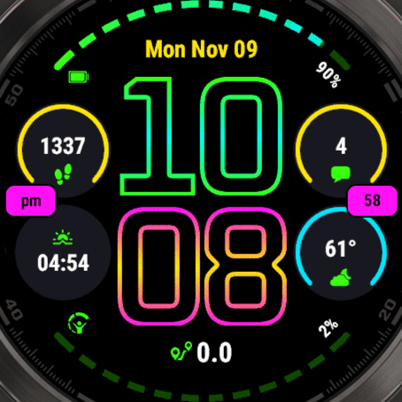
- Segments: Off, 4, 6, 8 or 12. Splits both arcs into segments with a small gap between them. The ends of the arcs stay round.
| Arc Style | What it does |
|---|---|
| Gradient | From Color 1 to Color 2 over the full arc, filled up to the progress. |
| Color merge | One color, from Color 1 at 0% to Color 2 at 100%. |
| Single color | Color 1 below 33%, Color 2 below 67%, then Color 3. |
| Single color filled | The same colors, but the arc is always full: only the color shows the progress. |
Arc Style
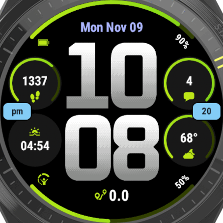
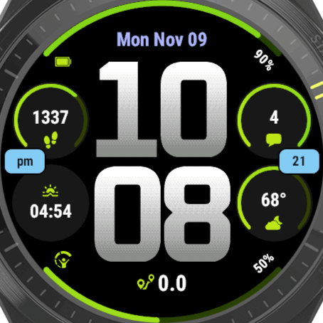
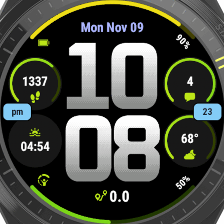
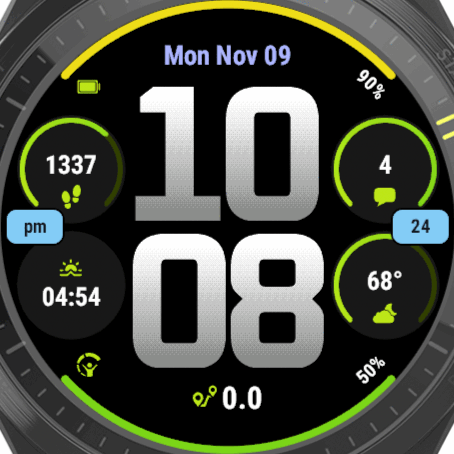
Segments
These themes come with segments. You can turn them on or off in any theme.
Circles
The four circles are in Advanced options → Circles. A circle shows the icon of its field above the value.
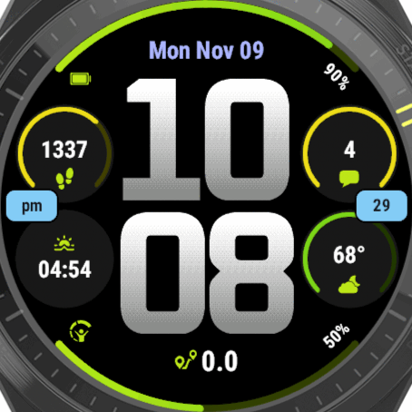
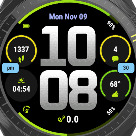
A field with a goal or progress, such as Steps Today, gets a ring inside its circle. The ring goes three quarters around, with the opening at the bottom, and the icon moves into that opening. A field without progress, such as the temperature, has no ring. See Goals & Progress Bars to set your own goal.
- Top Left, Top Right, Bottom Left, Bottom Right: the fields.
- Circle Color: the fill of the circles. Keep it dark, so your data stays easy to read.
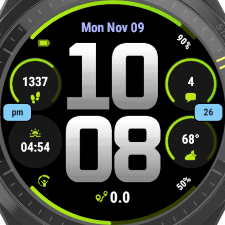
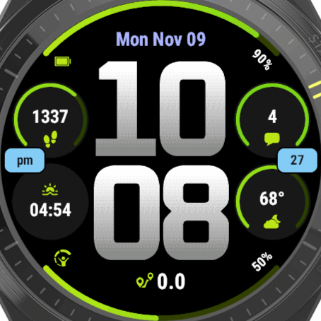
- Ring Style: Gradient, Color merge, Single color or Single color filled, as for the arcs.
- Color 1, Color 2, Color 3: the ring colors. Color 3 only appears with the single color styles.
- Unfilled: 70% darker, 40% lighter or Pick color, as for the arcs. Not with Single color filled.
The rings have their own style and colors, separate from the arcs, and are never split into segments. The icon uses the Icon Color and the value the Text Color. Change those in Colors.
Ring Style
Pills & Bottom
These are in Advanced options → Pills & Bottom.
- Left Pill: am/pm by default.
- Right Pill: the seconds by default.
- Bottom: the field below the time, Distance Today by default, with its icon left of the value.
- Pill Color, Pill Text Color: the colors of both pills.
A pill grows with its text, and a pill with nothing to show is hidden. The pills have no icon, so short values work best. A pill that updates every second, such as the seconds, is not shown on the always-on display.
Date
Advanced options → Date has the Date field and the Date Color. The date is a data field like the others, so you can also put something else at the top.
To show the date in another format, see Custom Date & Time Formats. For the language of the date, see Date Language & First Day of Week.
Background pattern
AMOLED only. Find it in Advanced options → Background.
- Background: the pattern behind the face, on or off. It's on by default.
- Background Color: only while the pattern is on. It tints the pattern: keep it dark, so your data stays easy to read.
The pattern only shows when the time has No Gradient, or when the time font is Squares (see Time fonts). When it can't show, the Background row says Not with a gradient on an anti-aliased font. The default theme has a gradient, so you won't see the pattern until you turn the gradient off or pick Squares.
Themes
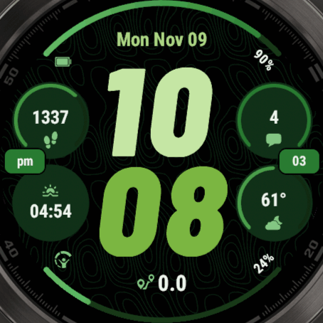
AMOLED watches have 16 themes and MIP watches 12, as they show colors very differently. MIP also has a theme with a light background, Light. See all of them on the themes page.
A theme sets the colors, the time fonts, the Gradient Style, the Arc Style, the Ring Style and the Segments. Your data fields stay as they are, and so does the background pattern on or off. So choose your theme first, then change what you like.
These themes come with segmented arcs:
- AMOLED: Ocean (6), Ice (8), Ember (4), Graphite (8), Neon (12), Violet (6), Sky (8) and Candy (4)
- MIP: Ocean (6), Ice (8), Ember (4), Light (8), Neon (12) and Coral (6)
Can't decide? The last option in the theme picker, AI Gen, makes a new set of colors and time fonts every time, starting from the Quadra Lime theme. You can also put Generate AI Theme on a touch area.
See Themes for how themes work, and how to keep your own look.
MIP watches
Quadra looks the same on MIP and AMOLED watches, with a few differences:
- MIP screens have only a few colors, so the gradients of the arcs, the rings and the time are mixed from dots (dithered).
- There is no background pattern and no Always-On Display menu: a MIP screen is always on.
- MIP has its own 12 themes.
Always on
When you lower your wrist, the watch goes into low power mode, and Garmin only gives a watchface a very short moment to draw something new every second. Quadra uses that moment for the fields that are set to update every second, such as the seconds in the right pill.
- Set the refresh time of a field to Always on in its Data Options.
- Only one row of the screen can be drawn per second. With always-on fields on different rows, they take turns.
- Everything else updates on the next minute. When you raise your wrist, everything updates as usual.
Always-On Display, AMOLED watches
There are two places for these settings. The fonts and the color of the time are in Time options, everything else in Advanced options → Always-On Display. The always-on display has to stay under 10% brightness, or the screen turns off. See Always-On Display for how that works.
Advanced options → Always-On Display
- Mode: what stays on the screen, see below.
- Data Field: the field to show, in the modes with a data field. This is the AOD Field, the date by default.
- Shift: moves the screen a few pixels to prevent burn-in. The moving modes move further.
- Time Brightness: how bright the time is.
- Data Brightness: how bright your data is. If the screen stays dark, keep this under 80%.
- Data Color Filter: white keeps the colors as they are.
Time options
- Hour AOD Font, Minute AOD Font: Outlined by default: the Outlined version of your time font, which lights far fewer pixels. Squares has no Outlined version, so it stays as it is. You can also pick any other time font.
- AOD Time Color: white = keep as is. The time keeps its own colors, and its gradient. Any other color makes the whole time that color.
The modes
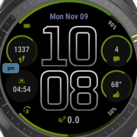
Full AOD
The default. Your data, the circles and the arcs, dimmed. Without the pill of the seconds.
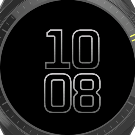
Time only
Only the time, in the middle of the screen.
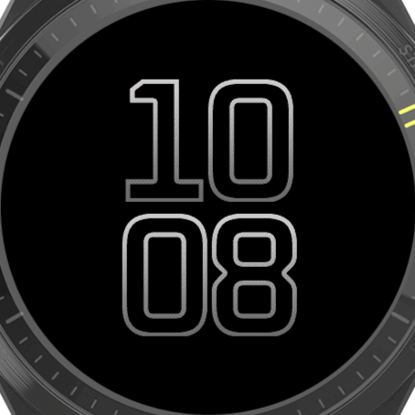
Time only, moving
The time moves to a new place every minute.
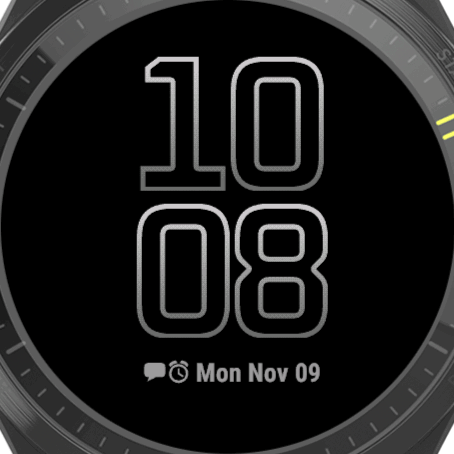
Time + data field
The time, with the AOD Field below it.
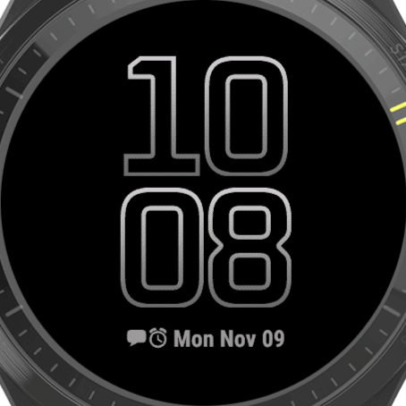
Time + data field, moving
Both move to a new place every minute.
Screen off
The screen is off until you raise your wrist. This saves the most battery.
Instinct Crossover
The Instinct Crossover has real, physical hands. The watchface can draw a highlight on those hands, so they stand out against the screen. Find it in Advanced options → Hand Highlights.
- Hand Style: the shape of the highlight, or No Highlight. Fade-in, solid, Top Only, and 30% transparent versions, each in small, medium and large.
- Second Hand: No Second Hand, Fade-in or Solid.
- AOD Style: the highlight on the always-on display: No Highlight, Keep as is, Green, Red or Blue Lume, Custom Color, 40% darker or 60% darker.
- Minute Color, Hour Color, Second Hand Color: the colors of the highlights. These are their own settings, a theme doesn't change them.
- AOD Custom Color: only with AOD Style set to Custom Color.
The highlights are saved per profile.
Touch areas
On a watch with a touch screen, every field can open a shortcut. This watchface also has 4 touch areas of its own: Hour and Minute (the two lines of the time), Left Pill and Right Pill.
Set them in Advanced options → Touch options. See Touch & Shortcuts for how to set them up, and for what a shortcut can do, such as the next profile or a new AI theme.
Free and PRO
The PRO version from the Connect IQ store is fully unlocked. In the Free version, these need PRO:
- Data fields marked [PRO]. You can try one for an hour, then it shows PRO instead of its value.
- Touch shortcuts. You can try them for an hour, starting with the first shortcut you use.
- More than 2 profiles
To activate the Free version, open Pro Status → Activate and enter your code, or enter it as the Pro Code in the settings on your phone. Your phone needs to be connected. See Free vs PRO & Activation, which also explains which version to choose.
More documentation
This manual only covers what is specific to Quadra. The settings system works the same on every watchface with its settings on the watch, and the On-Watch Settings documentation explains all of it. For example:
- Settings Menu Map: everything in the settings menu, in one overview
- All Datafields: every field you can pick, with a search box
- Alternative Times: show the time in another city in any field
- Refresh Time: how often a field updates, and how that saves battery
- Custom Date & Time Formats: show the date or time exactly the way you want
- Goals & Progress Bars: set your own goal for an arc or a ring
- Labels, Colors & Offsets: change the icon, color or position of a single field
- Profiles: save different setups and switch between them
- Themes: how themes work, and how to keep your own look
- Colors: change any color, or type an exact one
- Fonts: this watchface has an Hour, Minute, Text, Small, Date and Bottom font, and two AOD fonts on AMOLED
- Plugins: more data with OWM Weather GB, YR Weather GB, CGM+ and Tides GB
- Data From Other Apps: show values from apps that support complications
- Troubleshooting: what to do when something doesn't work
Have a question? See the Frequently Asked Questions.