Orbix - GB - Manual

Field names

Fonts

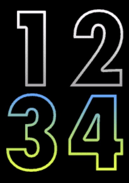
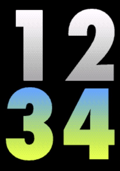
Barlow
Barlow font
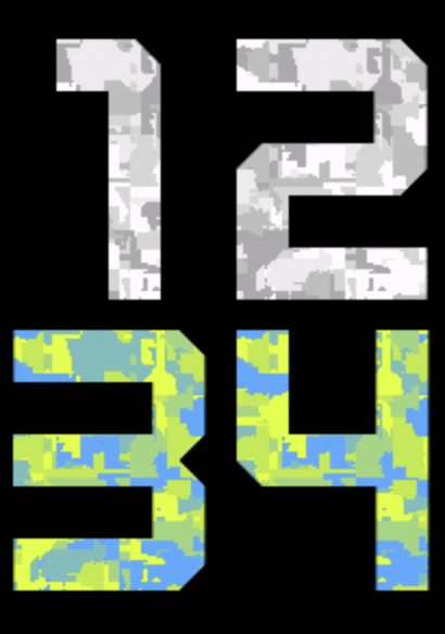
Kine
Kine font
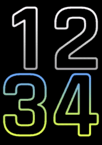
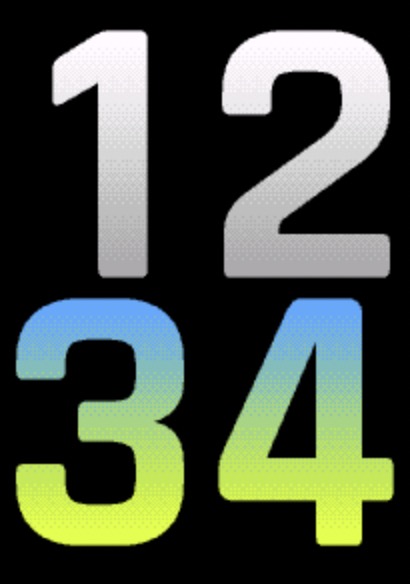
Nunito
Nunito font
Orbix
Orbix font
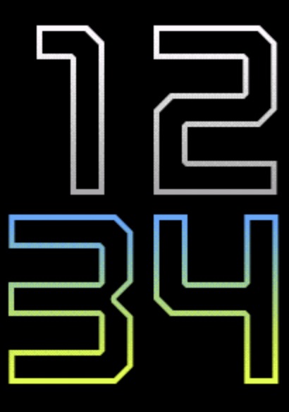
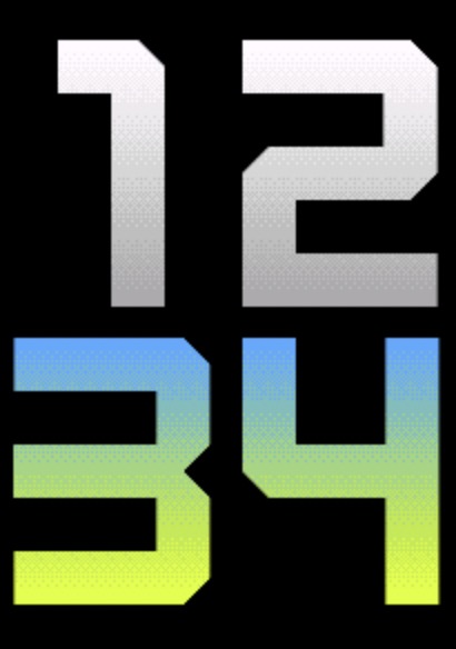
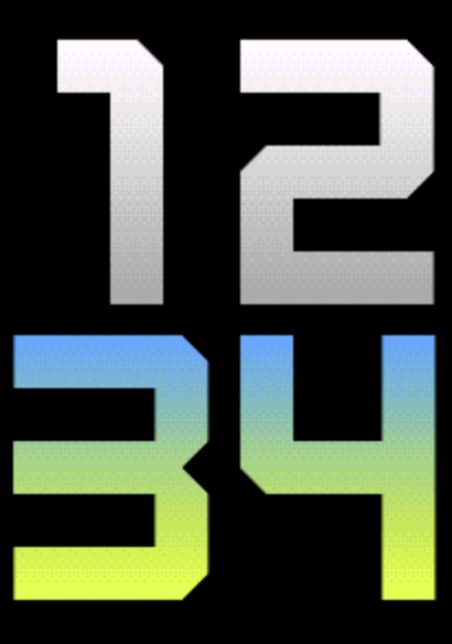
Squares
Squares font

Circle Styles

Choose from several circle styles to customize the progress ring appearance. When using a segmented style, a segment only lights up once it is completely full. Single color styles adopt a fixed color blended between the defined start and end color. On AMOLED devices, an additional third color can be set to appear between the start and end color for a richer gradient effect.

Double Gradient with Offset
Double Gradient
Double Gradient
Single Gradient
Single Gradient
Double Gradient 3 Colors (AMOLED)
Double Gradient 3 Colors
Segmented
12 Segments 6 Gap

12 equal segments with 6 px gaps between them. Fewer, chunkier blocks with clearly visible spacing.

12 Segments 6 Gap
24 Segments 4 Gap

24 segments with 4 px gaps. More granular than 12-segment, with tighter spacing between blocks.

24 Segments 4 Gap
60 Segments

60 fine segments with minimal gaps, giving a near-continuous ring that still fills one step at a time.

60 Segments
Single Color Mixed

The ring color is determined by the current progress, blending between your chosen start and end color. For example, with white as the start color and red as the end color: at low progress the ring is white, at 50% it shows a light red (an equal mix of both), and at full progress it is solid red. The images below show this at 2, 21, 37 and 58 out of 60 steps.

2 / 60

Single Color 2/60

21 / 60

Single Color 21/60

37 / 60

Single Color 37/60

58 / 60

Single Color 58/60
Single Color (switch)

Instead of blending, this style switches between colors based on progress thresholds. With 2 colors: the start color is shown below 50%, and the end color at 50% and above. With 3 colors: the start color is shown below 33%, the middle color from 33% to 66%, and the end color from 66% onwards. In the examples below, green is the start color, red is the end color, and yellow is the middle color.

Start color — green (< 33%)

Single Color Switch — green

Middle color — yellow (33–66%)

Single Color Switch — yellow

End color — red (≥ 66%)

Single Color Switch — red

Offsets

The watchface allows you to customize the spacing and positioning of time elements and data fields independently using offset settings. This gives you fine control over the layout to match your preferences.

Offset Settings

Time Offsets

Controls the X and Y position of the time display.

Default: 20

Field X Offsets

Controls horizontal positioning for all configurable fields. In order: Top 1, Top 2, Center L, Center R, Center, Bottom L, Bottom R, Circle L, Circle R, Circle Bottom

Default: 20

Field Y Offsets

Controls vertical positioning for all configurable fields. Uses the same field order as Field X Offsets.

Default: 20

Label Y Offsets

Controls vertical positioning for label fields. In order: Top 1, Top 2, Center, Circle L, Circle R, Circle Bottom

Default: 20

Battery Optimization

This watchface is optimized for all supported devices. For the best battery life, use the AOD option "Time Only" or turn AOD completely off.
To improve efficiency, avoid fields that update often, such as seconds, heart rate, and stress. When using these fast updating fields, try to avoid placing them in the progress circles.
AOD brightness also has a big impact. You can set separate brightness levels for data, hands, and background. Lower brightness gives better battery life.