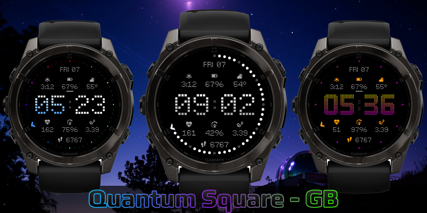
Quantum Square
Download Options
 Free Version
Purchase Watchface - $3.99


Quantum Square - GB - Manual
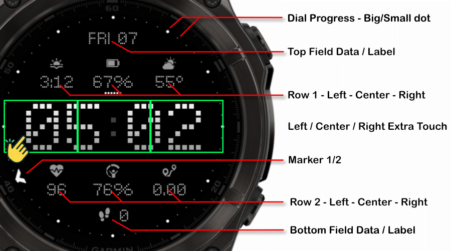
Field names
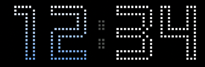
Fonts
This watchface comes with 6 built-in fonts:
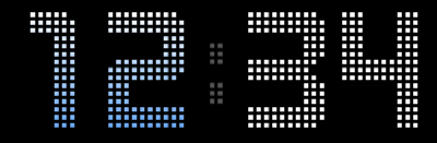
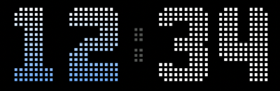
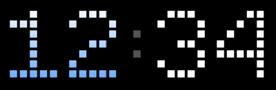
Barlow Dots Outlined
Barlow Dots
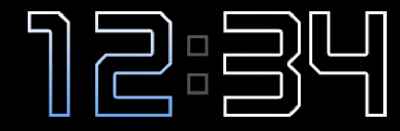
Barlow Outline
Barlow Solid
Lotta Squares
Single Squares
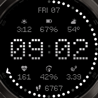
Dial Progress Styles
The watchface offers three different progress dial styles, each with unique visual characteristics. You can also apply special color schemes to enhance the appearance.
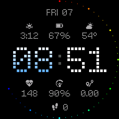
Progress Styles
Full Dial with bigger dot size (6x6)
You can adjust the dot size for the dial markers.
Full Progress
The entire dial ring acts as a progress indicator, filling up as your goal progresses.
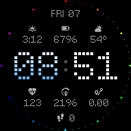
Second Marks as Progress
Individual second markers light up progressively.
Special Color Schemes
Rainbow - Big Dots Only
Rainbow applied to big dots only
Rainbow - Full Dial
Rainbow applied to big and small dots
Xmas Colors
Festive red and green color scheme
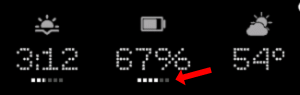
Field Progress
The field progress indicator shows visual progress for your data fields. You can customize how the progress is displayed.
Visual Example
Available Options
Show Field Progress
Display the default field progress indicator for your data fields.
Full
Show the field progress as completely filled.
Empty
Show the field progress as empty.
Hide
Hide the field progress indicator completely.
Offsets
The watchface allows you to customize the spacing and positioning of time elements and data fields independently using offset settings. This gives you fine control over the layout to match your preferences.
Offset Settings
Time Offsets
Controls X Hour, Y Hour, X Minute, and Y Minute positioning.
Default: 20,20,20,20
Field X Offsets
Controls horizontal positioning for Top, R1 Left, R1 Center, R1 Right, R2 Left, R2 Center, R2 Right, and Bottom fields.
Default: 20,20,20,20,20,20,20,20
Field Y Offsets
Controls vertical positioning for Top, R1 Left, R1 Center, R1 Right, R2 Left, R2 Center, R2 Right, and Bottom fields.
Default: 20,20,20,20,20,20,20,20
Label Y Offsets
Controls vertical positioning for labels: R1 Left, R1 Center, R1 Right, R2 Left, R2 Center, and R2 Right.
Default: 20,20,20,20,20,20
Visual Examples
Label Y offsets (30,20,30,0,20,0):
Spacing the labels.
Move time up and left (0,0,0,0):
Idk why you would want this, buy here we are, it's possible.
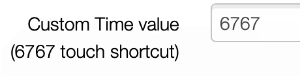
Touch Shortcut 6767
The Touch Shortcut 6767 feature allows you to set a custom time value that will be displayed when you activate the shortcut. Hold the shortcut again to go back to normal.
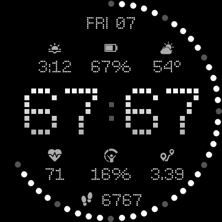
Setting Your Custom Value
You can configure the custom value in the watchface settings. The value can be up to 4 characters long.
Allowed Characters
Only the following characters are allowed:
0 1 2 3 4 5 6 7 8 9 : . space
Maximum 4 characters
Battery Optimization
This watchface is fully optimized for all supported devices. For optimal battery life, use the AOD option "Time Only" with a tint color for best results.
To maximize battery efficiency, minimize frequently updating fields such as seconds, heart rate, and stress.
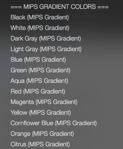
What is MIP gradient and how do I set it?
MIP devices only have 64 colors that can be displayed. When trying to display a color that is in between colors, like in a gradient, the device will pick the color closest to one of the colors it is able to display, so instead of an actual gradient, it will jump between the colors that it can display.
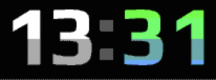
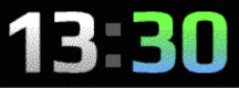
Regular Gradient vs MIP Gradient
On this watchface, the default gradient will look like the first image when NOT using MIP gradient. You can clearly see the lines where one color ends and where the other starts. When using one of the MIP gradient colors, the colors will be dithered, so it looks a lot better on a MIP device.
Regular Gradient on a MIP device. You can clearly see the jump between colors:
MIP Gradient. The dithering makes the transition between colors smoother:
You can find the MIP gradient colors all the way on top of the Color list. You can combine any of the MIP gradient colors together. When mixed with a regular color, it will use the default gradient method instead.