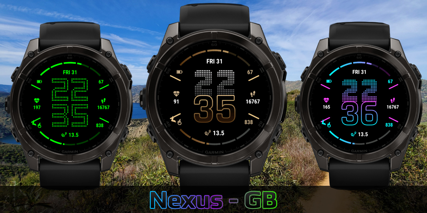
Nexus
Download Options
 Free Version
Purchase Watchface - $3.99


Nexus - GB - Manual
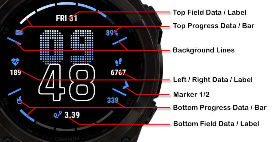
Field names
Fonts
This watchface comes with 4 built-in fonts, plus the same with outlined versions:
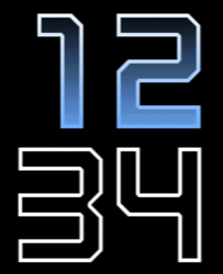
Barlow
Regular:
Outlined:
Barlow Dots
Regular:
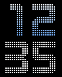
Outlined:
Bionic
Regular:
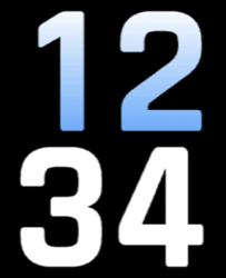
Outlined:
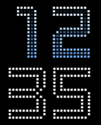
Nomad Dots
Outlined Fonts and MIP Gradients
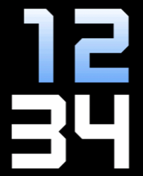
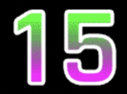
Outlined fonts can be filled with another color to create interesting visual effects.
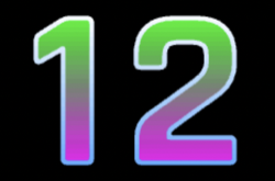
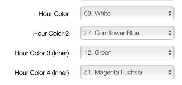
Filled Color Example
You can fill outlined fonts with a different color for a striking appearance:
MIP Device Limitations
On MIP devices, the outline color can only be a regular gradient or the same solid color. MIP gradient does not work when you want to fill the background of outlined fonts.
Offsets
The watchface allows you to customize the spacing and positioning of time elements and data fields independently using offset settings. This gives you fine control over the layout to match your preferences.
Offset Settings
Time Offsets
Controls X position, Y position, X spacing between elements, Y spacing, and Y position for minutes.
Default: 20,20,20,20,40
Field X Offsets
Controls horizontal positioning for Top, Left, Right, Bottom, Progress 1, and Progress 2 fields.
Default: 20,20,20,20,20,20
Field Y Offsets
Controls vertical positioning for Top, Left Text, Right Text, Bottom, Progress 1, Progress 2, Left Label, and Right Label.
Default: 20,20,20,20,20,20,20,20
Visual Examples
Default Offsets (20,20,20,20,40):
Standard spacing with balanced layout.
Increased Spacing (20,20,40,40,40):
Wider spacing for a more spread out appearance.
Battery Optimization
This watchface is fully optimized for all supported devices. For optimal battery life, use the AOD option "Time Only" with a tint color for best results.
To maximize battery efficiency, minimize frequently updating fields such as seconds, heart rate, and stress.
What is MIP gradient and how do I set it?
MIP devices only have 64 colors that can be displayed. When trying to display a color that is in between colors, like in a gradient, the device will pick the color closest to one of the colors it is able to display, so instead of an actual gradient, it will jump between the colors that it can display.
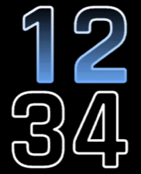
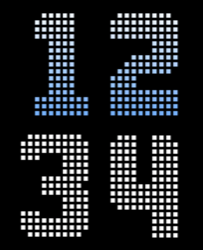
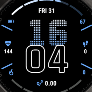
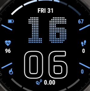
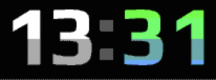
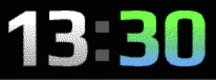
Regular Gradient vs MIP Gradient
On this watchface, the default gradient will look like the first image when NOT using MIP gradient. You can clearly see the lines where one color ends and where the other starts. When using one of the MIP gradient colors, the colors will be dithered, so it looks a lot better on a MIP device.
Regular Gradient on a MIP device. You can clearly see the jump between colors:
MIP Gradient. The dithering makes the transition between colors smoother:
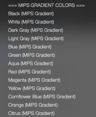
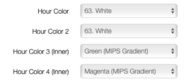
You can find the MIP gradient colors all the way on top of the Color list. You can combine any of the MIP gradient colors together. When mixed with a regular color, it will use the default gradient method instead.