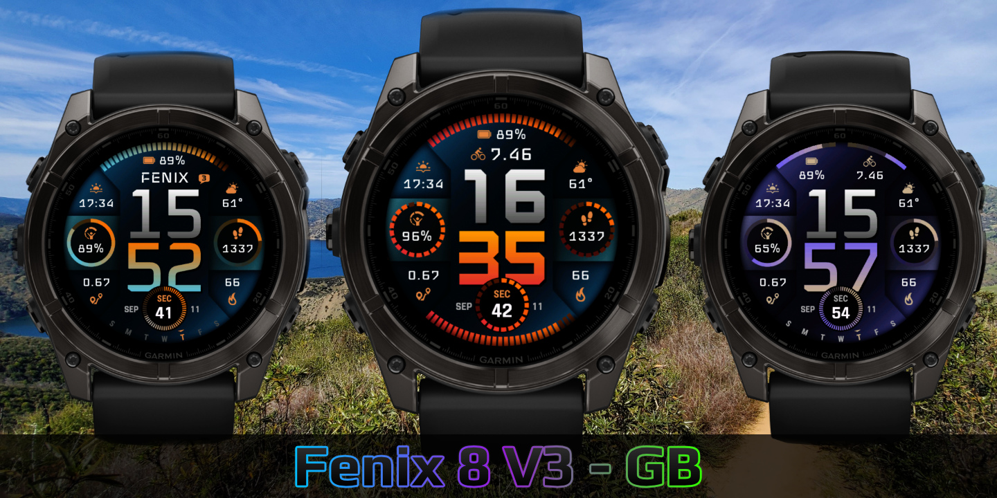
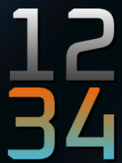
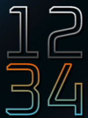
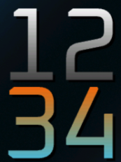
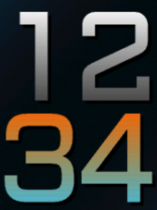
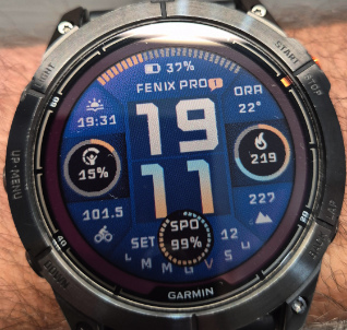
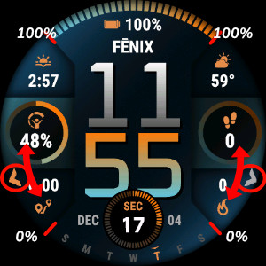
Fenix 8 V3
Download Options
 Free Version
Purchase Watchface - $4.99


Fenix 8 V3 Manual
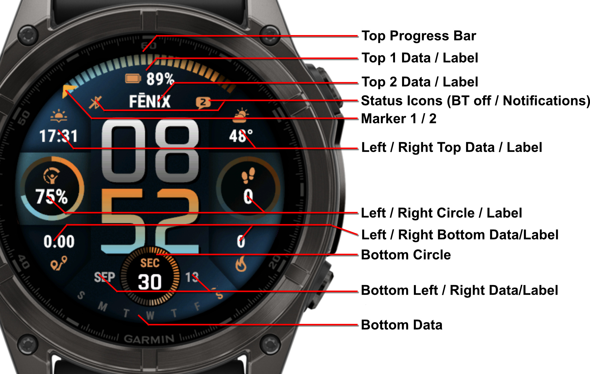
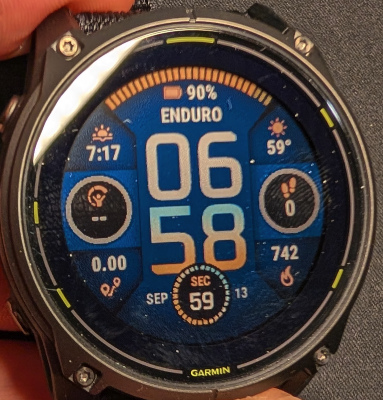
Field names
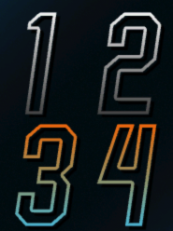
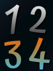
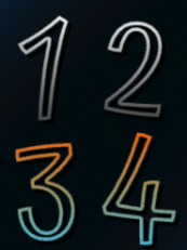
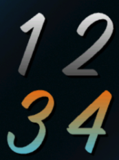
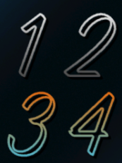
Fonts
This watchface comes with 7 built-in fonts, plus the same with outlined versions. Other fonts are also available depending on your device. Note that those fonts don't have outlined versions, and can cause AOD to stop working.
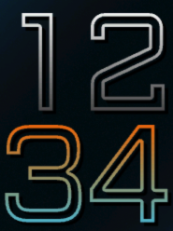
Fenix 8 V3 Bold
Regular:
Outlined:
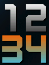
Fenix 8 V3 Medium
Regular:
Outlined:

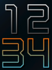
Phoenix PRO
Regular:
Outlined:
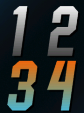
Barlow
Regular:
Outlined:
Fenix 8 V1 Legacy
Regular:
Outlined:
Happy
Regular:
Outlined:
Story
Regular:
Outlined:
Top Styles
The top section of the watchface offers various style options for displaying information in the upper area. These styles affect how content is presented in the top field area.
Available Top Styles
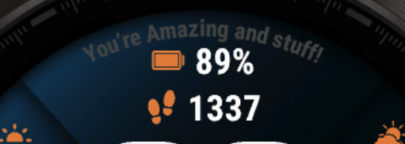
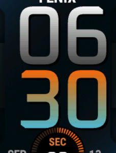
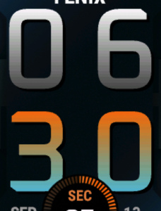
Progress Bar + two fields - Default:
Two fields with Progress:
Weekdays:
Radial Field (see below):
Sundial:
Bottom Styles
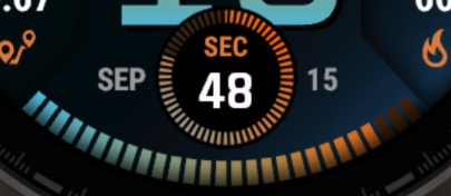
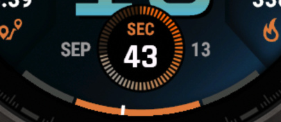
The bottom section provides different styling options for the lower area of the watchface. The bottom circle field is specifically optimized for seconds display but can accommodate various data types.
Available Bottom Styles
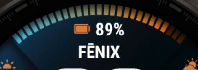
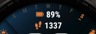
Default: Weekdays
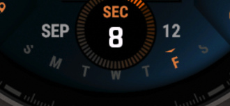
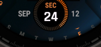
Radial Datafield (See Below):
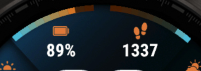
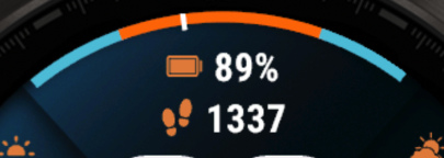
Progressbar + 2 fields:
2 Fields + Progress:
Sun Progress:
Progress Circle Gaps
Progress circle gaps allow you to customize the spacing and appearance of progress indicators on your watchface. You can adjust the gap size and number of segments to create different visual effects.
Video Tutorial
Gap Examples
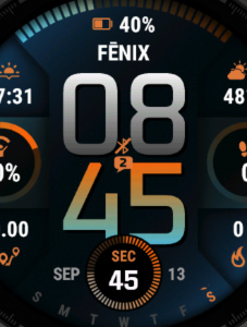
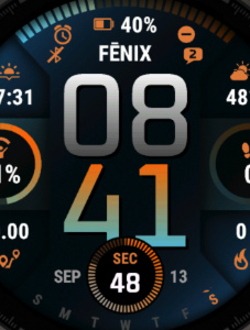
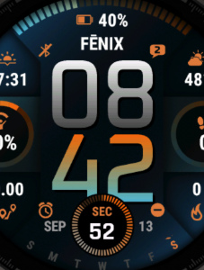
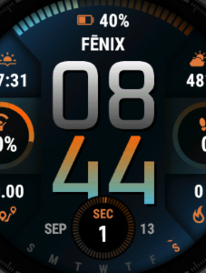
Below are examples showing different gap configurations. The format is "Gap Size / Number of Segments".
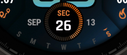
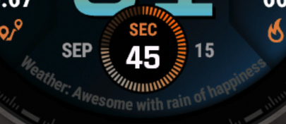
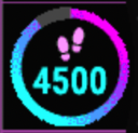
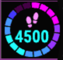
No Gaps (0/21)

Small Gaps (4/12)
Small Gaps (4/21)
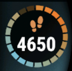
Large Gaps (8/6)
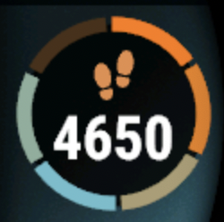
Large Gaps (8/12)
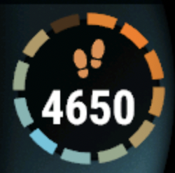
Large Gaps (8/24)
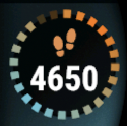
Configuration Tips
- More segments with smaller gaps provide higher precision for progress tracking
- A segment does only fill up if it is 100% done. So if your goal is 100 steps, the circle has 10 segments and have done 98 steps, 9/10 segments will show up as filled. Once you hit 100, the 10 segments will be filled.
- No gaps (0) create a continuous circle
- Experiment with different combinations to find your preferred style
Radial Datafield
Device Compatibility Notice
This feature is not available on all devices. Your device needs to support vector fonts. Devices like Instinct 3, Venu 2, Descent G2, FR255, and some others do not support this feature. If it is not supported, the option doesn't show up in the settings.
The Radial Datafield displays data in a circular text arrangement around the watch face. The contents of this field can be configured using the "Radial Data Field" setting.
Configuration
- Font & Color: Set using the Weekdays font and color settings
- Position: Adjust using the weekdays offset settings
- Performance Impact: Requires Top 1 and Top 2 fields to be redrawn when updated because they share the same space
Examples
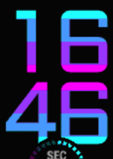
Radial Datafield in Action:
Shows data arranged in a circular pattern around the watch face
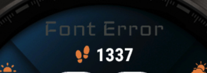
Font Error Example:
Shows what happens when using incompatible fonts
Performance Tip
Avoid using fast-updating fields like Stress, Heart Rate, or Seconds with the radial datafield as it can cause battery drain due to frequent redraws of the top fields.
Battery Optimization
This watchface is fully optimized for all supported devices. There are a few things to consider when setting up your configuration:
- 1 For optimal battery life, use the AOD option "Time Only" with a tint color for best results. A tint color is best because it stops gradients from being drawn in AOD mode, saving some CPU cycles.
- 2 Frequently updating fields such as seconds, heart rate, and stress use more power since the screen has to be updated more often.
- 3 The bottom circle field is specifically optimized for seconds display, placing seconds elsewhere will consume more power. For best battery, turn the bottom circle completely off. Since it draws over the time, it has to be redrawn every time the time changes.
- 4 The Top progress bar and top fields share space, meaning when one of them changes, they all have to be redrawn, best to avoid fast updating data here.
- 5 The Bottom left and right field require the Center bottom field to be redrawn.
- 6 If your watch is set to not use AOD, configure the watchface AOD mode to "Turn screen off". On some watch models, data processing continues even when AOD is disabled. By selecting "Turn screen off", you ensure no data is processed while the screen is off, maximizing battery savings.
- 7 On MIP devices, screen updates are what counts most. To save a bit of battery, turn off "Always on seconds".
- 8 Lastly: Redrawing fields cost more power, but since most watches spent 95% of their time in AOD mode, the AOD settings have by far the most impact.
What is MIP gradient and how do I set it?
MIP devices only have 64 colors that can be displayed. When trying to display a color that is in between colors, like in a gradient, the device will pick the color closest to one of the colors it is able to display, so instead of an actual gradient, it will jump between the colors that it can display.
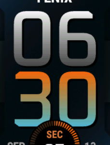
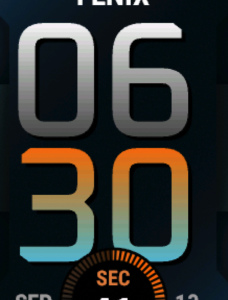
Regular Gradient vs MIP Gradient
On this watchface, the default gradient will look like the first image when NOT using MIP gradient. You can clearly see the lines where one color ends and where the other starts. When using one of the MIP gradient colors, the colors will be dithered, so it looks a lot better on a MIP device.
Regular Gradient (color jumps visible):
MIP Gradient (smooth dithering):

Tip: You can find the MIP gradient colors at the top of the Color list. You can combine any MIP gradient colors together. When mixed with a regular color, it will use the default gradient method instead.
Top Progress
The Top progress bar can be set to use a gradient, but currently this only works when using one of the simple lined backgrounds.
With Gradient:
Without Gradient:
Side Circles Progress
The Side circles also can work with gradients, these work on every background style.
With Gradient:
Without Gradient:
Limitations & Solutions
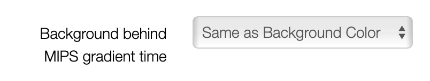
When using time with a MIP color, it requires a background color. When setting "Background behind MIP Gradient time" to "Same as Background Color", the watchface will attempt to match the set background color. However, since detailed backgrounds have patterns, it may not match correctly:
Background Setting:
Mismatch Issue:
Solutions:
- Try to match the color manually
- Disable MIP gradients
- Use the "Ellipse" background (see below)
Available Now - Ellipse Background
The latest update includes a new ellipse background that features your selected background color at the center, gradually fading to darker tones at the edges. This creates a smooth appearance that eliminates the visible squares that appeared behind the time display.
Preview:
Offsets
Offsets allow you to fine-tune the positioning of various elements on your watchface. This is particularly useful when you need to make small adjustments to ensure perfect alignment with different fonts.
All values are comma separated. Not the most user-friendly, but doing it this way saves a lot of memory, and most users don't need to adjust these values. When entering an incorrect value, or removing items, the offsets will be set back to default, so be careful with adjustments. The maximum number is 100, minimal is -80.
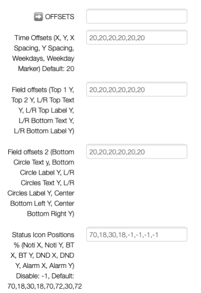
Time Offsets
Time offsets allow you to adjust the horizontal and vertical positioning of the time display, and the distance between numbers.
The default number is 20. Setting it to less moves the time Up or left, more is down or right. X is for the horizontal Axis (left-right), Y is for vertical (up/down). The number is the number of pixels it will move.
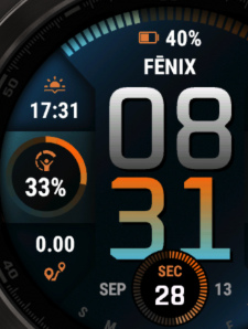
Example 1, default (20,20,20,20,20):
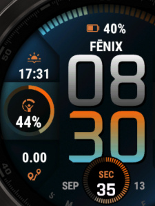
Example 2, moving slightly left (10,20,20,20,20):
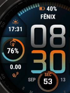
Example 3, moving slightly right and up (30,10,20,20,20):
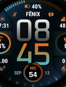
Example 4, further apart (20,20,80,40,20):
Weekday Offsets
Weekday Offsets allow you to set how far the weekdays are from the edge of the screen. This also applied to the radial field.
20 is the default and should be correct on your device with the default font. Set to a higher number to move closer to the edge, lower to move to the center of the screen. The last value is for the marker on top of the text and works in the same way. By default the marker offset and weekday offset should be the same.
Example 1 Default (20,20,20,20,20,20):

Example 2 Higher (20,20,20,20,10,15):
Example 3 Lower (20,20,20,20,30,30):
Field Offsets
Field offsets allow you to move fields around to align perfectly with any font.
Provided is the Y axis to move the fields up or down. Setting it to less moves the time Up, more is down. The number is the number of pixels it will move.
Example 1 default (Field Offsets 1: 20,20,20,20,20 Offsets 2: 20,20,20,20,20):
Example 2 Moving things down 10 pixels (30,30,30,30,30,30 / 30,30,30,30,30,30):
Example 3 Moving things up 10 pixels (10,10,10,10,10,10 / 10,10,10,10,10,10):
Status Icons
Status icon positions can be set here. You can also disable the icons completely by setting the values of that icon to -1. Note that the icon will only show when it is active, so if you have a notification, your bluetooth is off, DND is on, or if you have alarms set.
The values represent the percentage of the screen. X is horizontal, Y is vertical. Set X to 50 and Y to 25 to have the icon the center of the screen, 1/4 of the way down.
Example 1 Default (70,18,30,18,-1,-1,-1,-1):
DND and Alarms are OFF. Notification at 70% right and 18% down, Bluetooth at 30% right and 18% down
Example 2 Notification centered, BT on top (50,50,50,45,-1,-1,-1,-1):
Example 3 Notification and BT default, DND And Alarms on top (70,18,30,18,68,12,32,12):
Example 4 Notification and BT default, DND And Alarms on the bottom (70,20,30,20,70,77,30,77):
To disable all icons, set everything to -1: (-1,-1,-1,-1,-1,-1,-1,-1):
Markers
The markers feature allows you to display progress indicators around the watch face. You can choose between different marker styles to match your preference.
Regular Marker Style (Style 1)
In the regular marker style, markers are positioned around the entire watch face in a circular pattern, starting from the 12 o'clock position.
Side Marker Style (Style 2)
Marker Style 2 positions the markers on the sides of the watch face, creating a unique visual arrangement with markers on both the left and right sides.
Marker 1 (Left Side):
Positioned on the left side, ranging from 220 degrees to 320 degrees. This creates a vertical progress indicator along the left edge of the watch face.
Marker 2 (Right Side):
Positioned on the right side, ranging from 140 degrees to 40 degrees. This creates a vertical progress indicator along the right edge of the watch face.
💡 Note: Markers are not available on the Venu 2 (all models) and D2 Air X2 due to memory restraints.
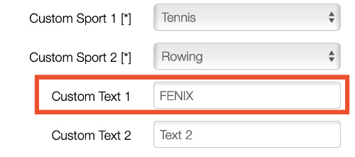
Change the Title Text
The "Fenix" text on your watch face can be customized to display any text you prefer. This allows you to personalize your watch face with your name, a motivational message, or any other text or datafield.
Video Tutorial
- Launch the Garmin Connect IQ app on your phone
- Open your installed watch face settings
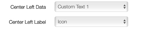
- Find the "Custom Text 1" setting (at the bottom)
- Enter your preferred text
- Press Save, and you're done