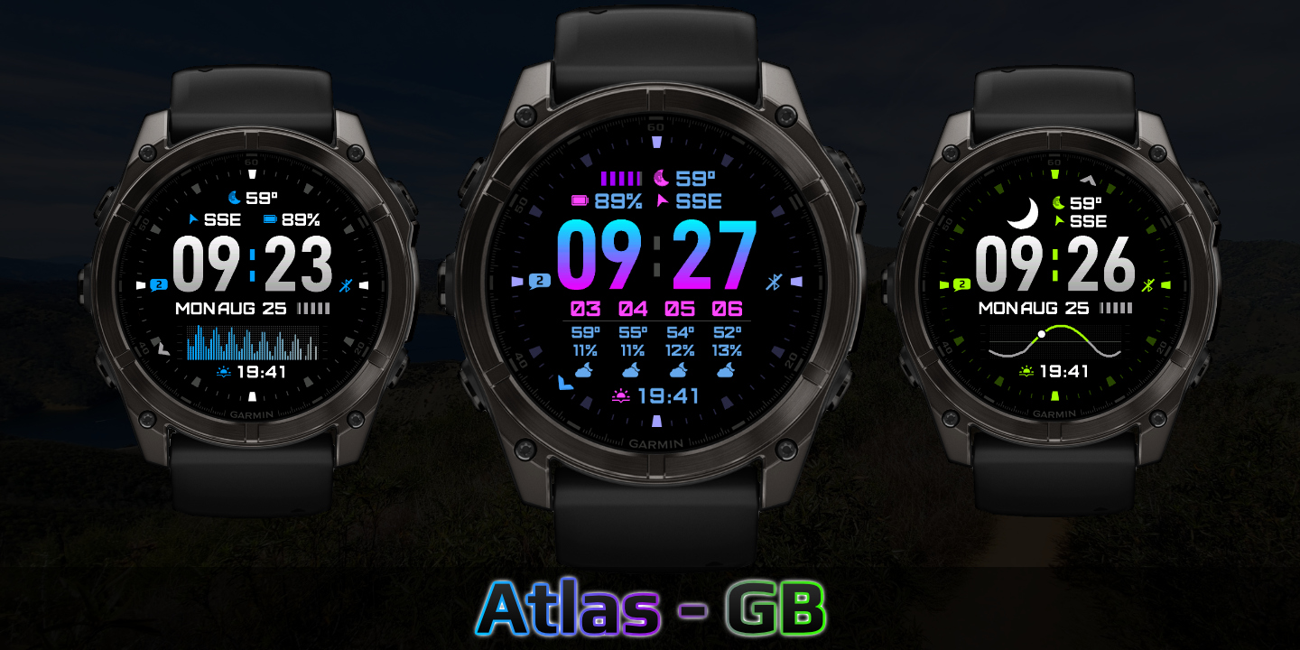
Atlas
Download Options
 Free Version
Purchase Watchface - $3.99


Atlas - GB - Manual
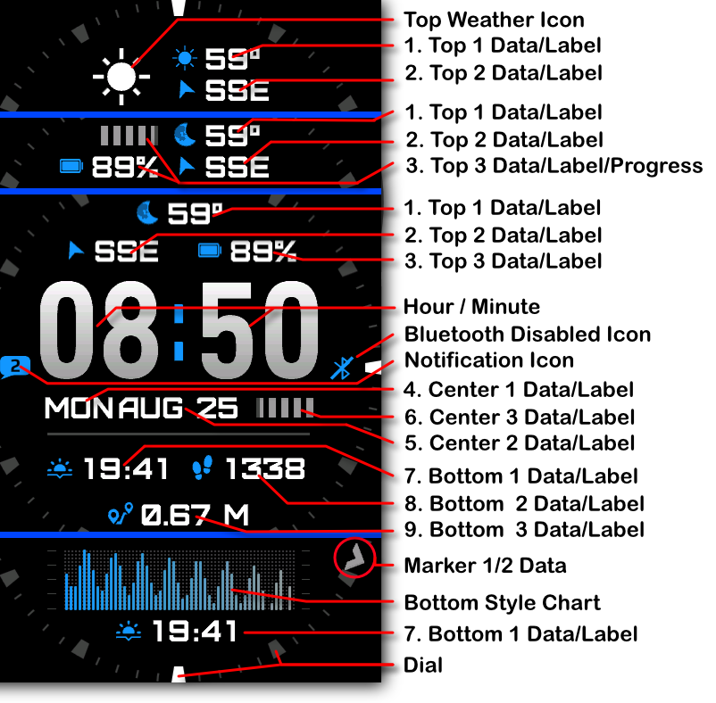
Field names
Top/Bottom styles
Different top and bottom section styles:
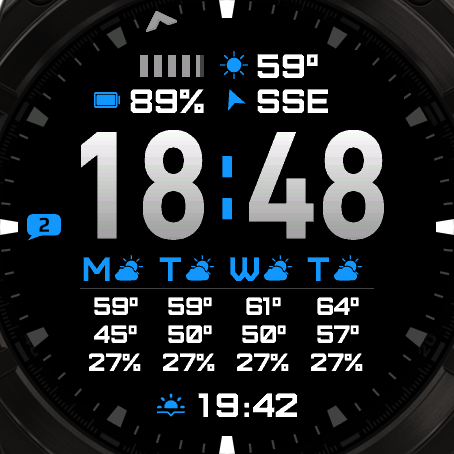
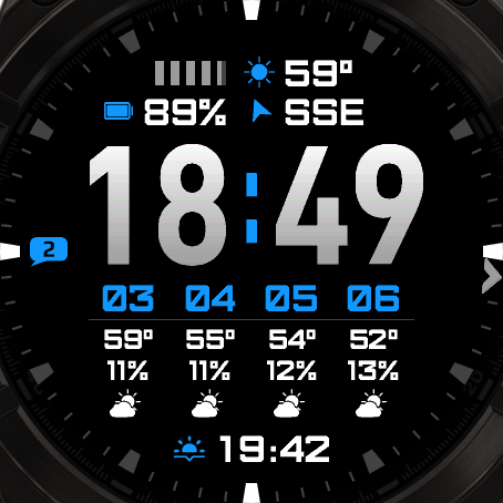
4 Day Weather
4 Hour Weather
3 Top Fields + Progress Chart
Top Progress
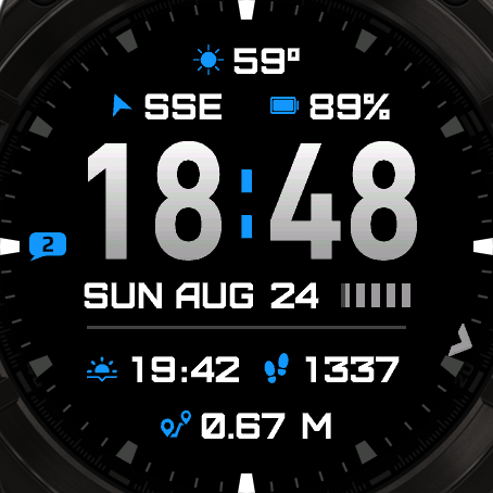
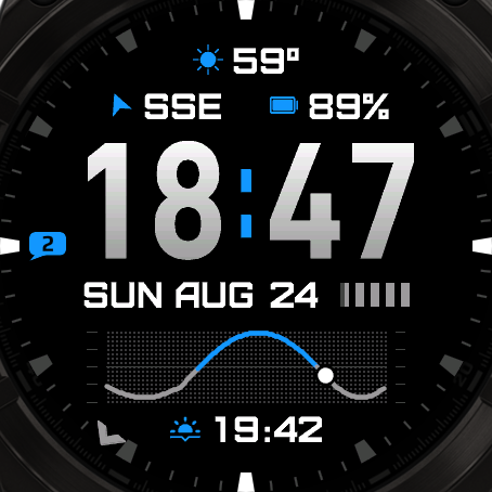
Top 3 fields + Bottom 3 fields
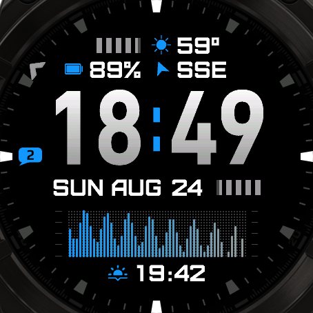
Top 3 fields + Bottom Graph
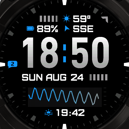
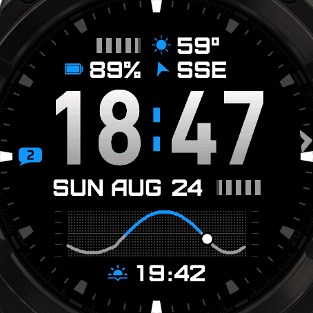
Top 3 fields + Sun Progress graph
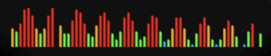
Heartrate Based
The chart will show the datapoint in the color of your HR zones:
- Zone 1:
- Zone 2:
- Zone 3:
- Zone 4:
- Zone 5:
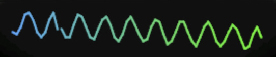
Linecharts
Pick a Linechart to draw a line instead of blocks.
Fonts
This watchface comes with 4 built-in fonts, plus the same with outlined versions:
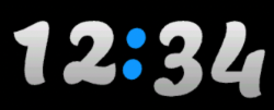
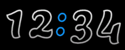
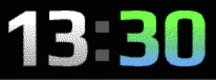
Atlas
Regular:
Outlined:
Barlow
Regular:
Outlined:
Lemon
Regular:
Outlined:
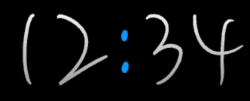
Scribble
Battery Optimization
This watchface is fully optimized for all supported devices. For optimal battery life, use the AOD option "Time Only" with a tint color for best results.
To maximize battery efficiency, minimize frequently updating fields such as seconds, heart rate, and stress. The center-right field is specifically optimized for seconds display; placing seconds elsewhere will consume more power.
What is MIP gradient and how do I set it?
MIP devices only have 64 colors that can be displayed. When trying to display a color that is in between colors, like in a gradient, the device will pick the color closest to one of the colors it is able to display, so instead of an actual gradient, it will jump between the colors that it can display.
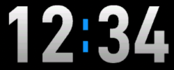
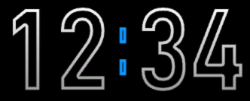
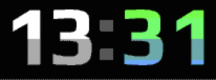
Regular Gradient vs MIP Gradient
On this watchface, the default gradient will look like the first image when NOT using MIP gradient. You can clearly see the lines where one color ends and where the other starts. When using one of the MIP gradient colors, the colors will be dithered, so it looks a lot better on a MIP device.
Regular Gradient on a MIP device. You can clearly see the jump between colors:
MIP Gradient. The dithering makes the transition between colors smoother:
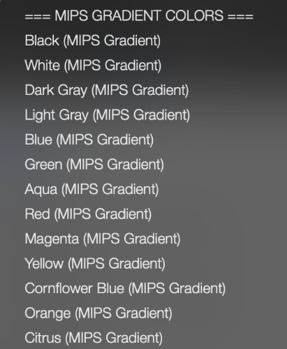
You can find the MIP gradient colors all the way on top of the Color list. You can combine any of the MIP gradient colors together. When mixed with a regular color, it will use the default gradient method instead.